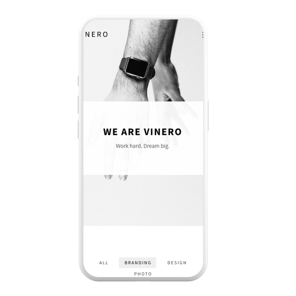
Light Gray Minimal Portfolio Website

Project Objectives:

  1. Design a light gray color scheme that exudes elegance and sophistication, complementing the professional tone of the portfolio.
  2. Develop a user-friendly interface that offers effortless navigation and ensures a seamless browsing experience for visitors.
  3. Present the creative professional’s portfolio in a clean and uncluttered manner, focusing on the quality, impact, and professionalism of the showcased work.
  4. Optimize the website’s performance to guarantee fast loading times, enhancing user engagement and satisfaction.
  5. Implement responsive design techniques to ensure compatibility and optimal viewing experience across various devices.

Overview

This case study presents the design and development of a light gray minimal portfolio website, showcasing the work of a creative professional.The website aimed to convey a sense of simplicity and clarity, allowing the showcased work to take center stage and providing visitors with a visually pleasing and professional user experience.

Design Process:

  • Moodboarding and Visual Exploration:

    • Create mood boards to gather visual inspiration and explore different aesthetics.
    • Experiment with various shades of light gray and complementary color palettes to find the perfect combination that reflects the desired professional tone.
    • Collect and curate design elements, textures, and patterns that align with the minimalistic and elegant theme.
  • Content Strategy and Information Architecture:

    • Develop a content strategy to define the types of content that will be included in the portfolio, such as project descriptions, client testimonials, and professional achievements.
    • Create a site map to determine the overall structure and organization of the website, ensuring logical navigation and a seamless user experience.
  • Prototyping and User Testing:

    • Build interactive prototypes to test the website’s functionality, user flows, and navigation.
    • Conduct user testing sessions to gather feedback and insights on the usability and effectiveness of the website’s design and features.
    • Iterate on the design and functionality based on user feedback, making refinements to enhance the user experience.
  • Branding and Visual Identity:

    • Develop a cohesive visual identity that aligns with the professional tone and communicates the creative professional’s personal brand.
    • Design a logo, typography, and color palette that complement the light gray minimal aesthetic and evoke professionalism and sophistication.
    • Apply the visual identity consistently throughout the website to reinforce brand recognition.
  • Content Creation and Curation:

    • Craft compelling and concise copy that effectively communicates the creative professional’s skills, expertise, and accomplishments.
    • Curate and carefully select the portfolio pieces to showcase, ensuring they align with the desired professional tone and highlight the breadth and depth of the creative professional’s work.
  • Interaction Design and Microinteractions:

    • Design intuitive and delightful interactions within the website, such as smooth scrolling effects, subtle hover animations, or transitions between sections.
    • Implement microinteractions, such as interactive buttons or progress indicators, to provide visual feedback and enhance the user experience.

FEATURES

  • Interactive Portfolio Galleries: The website includes interactive portfolio galleries with options for various display styles, such as grid, masonry, or carousel, enabling the creative professional to present their work in a visually captivating and engaging manner.

  • Project Filtering and Sorting: The website incorporates filtering and sorting options for the portfolio projects, allowing visitors to refine their viewing based on specific categories, tags, or project types, enabling efficient browsing and exploration.

  • Client Testimonials and Reviews: The website includes a section for client testimonials and reviews, showcasing feedback from satisfied clients and highlighting the creative professional’s expertise, reliability, and customer satisfaction.

  • Integration with Social Media: The website integrates with social media platforms, allowing visitors to easily share portfolio projects on their social media accounts, increasing exposure and potential reach to a wider audience.
  • Blog or News Section: The website includes a blog or news section, enabling the creative professional to share insights, industry trends, project updates, or thought leadership articles, fostering engagement and positioning themselves as an authority in their field.

Outcome:

The outcome of this project was a light gray minimal portfolio website that provided a seamless user experience. The clean and intuitive interface, combined with efficient navigation and fast loading times, ensured visitors could effortlessly explore the portfolio and access relevant information.

HAve

A project for us ?