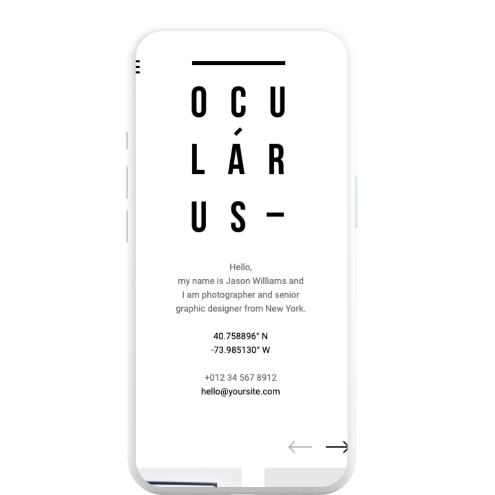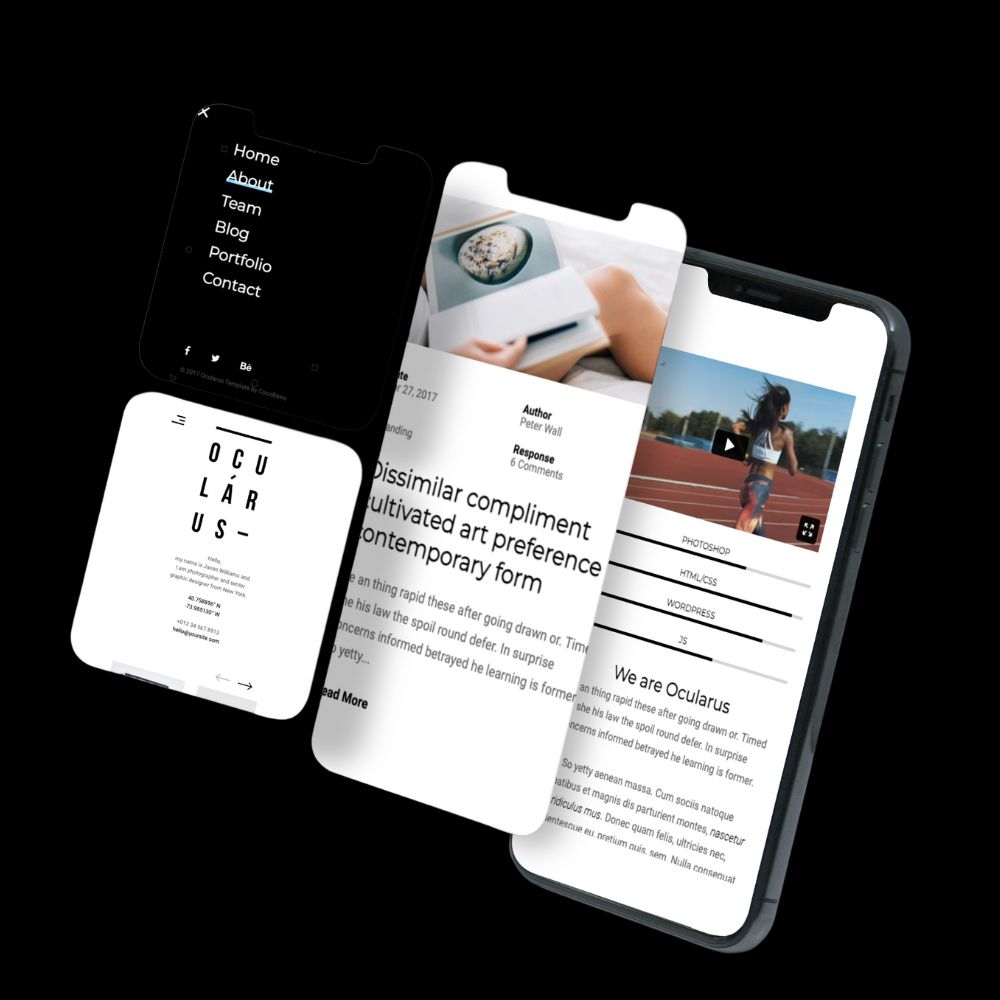
This case study focuses on the design and development of a white and light-grey minimal portfolio website. The objective was to create a clean and elegant online platform that effectively showcases a creative professional’s work and provides a seamless user experience. The website’s design aimed to prioritize simplicity and emphasize the showcased portfolio pieces.
Discovery Phase:
Wireframing and Prototyping:
Visual Design:
Development and Implementation:
Testing and Deployment:
Minimalistic Design: The website features a clean and minimalistic design with a white and light-grey color scheme, creating a visually elegant and sophisticated aesthetic.
User-Friendly Interface: The website is designed with a user-friendly interface, allowing visitors to navigate the website easily and find desired information without confusion.
Showcase Portfolio: The website provides a dedicated section to showcase the creative professional’s portfolio. It allows for the organized and visually appealing presentation of past projects, highlighting the skills and expertise of the individual.
Performance Optimization: The website is optimized for fast loading times and smooth browsing. Performance optimization techniques, such as code optimization, image compression, and caching, are implemented to ensure optimal website performance.
Responsive Design: The website is developed with responsive design techniques, ensuring compatibility and optimal viewing experience across various devices, including desktops, tablets, and mobile phones.
Contact Information and Contact Form: The website incorporates contact information, such as email address or phone number, to enable visitors to easily get in touch with the creative professional. Additionally, a contact form is included to facilitate convenient communication and inquiries.

The outcome of this project was a white and light-grey minimal portfolio website that effectively showcased the creative professional’s work. The website’s clean and elegant design created a visually pleasing experience, allowing visitors to focus on the portfolio pieces without distractions. The user-friendly interface enabled easy navigation and seamless browsing. The responsive design ensured a consistent and optimized experience across various devices and screen sizes. With fast loading times and efficient performance, the website provided a smooth user experience. The incorporation of contact information and a contact form facilitated easy communication between the creative professional and potential clients. Integration of social media links expanded the online presence and allowed for greater engagement. By implementing SEO techniques, the website improved its visibility in search engine results. Overall, the white and light-grey minimal portfolio website successfully represented the creative professional’s talent and attracted attention from potential clients.

Digital Creative LLC
We design awesome websites and apps while supercharging your online presence with top-notch digital marketing strategies. Let’s make your digital dreams a reality!”